Client Stories / Dotstash
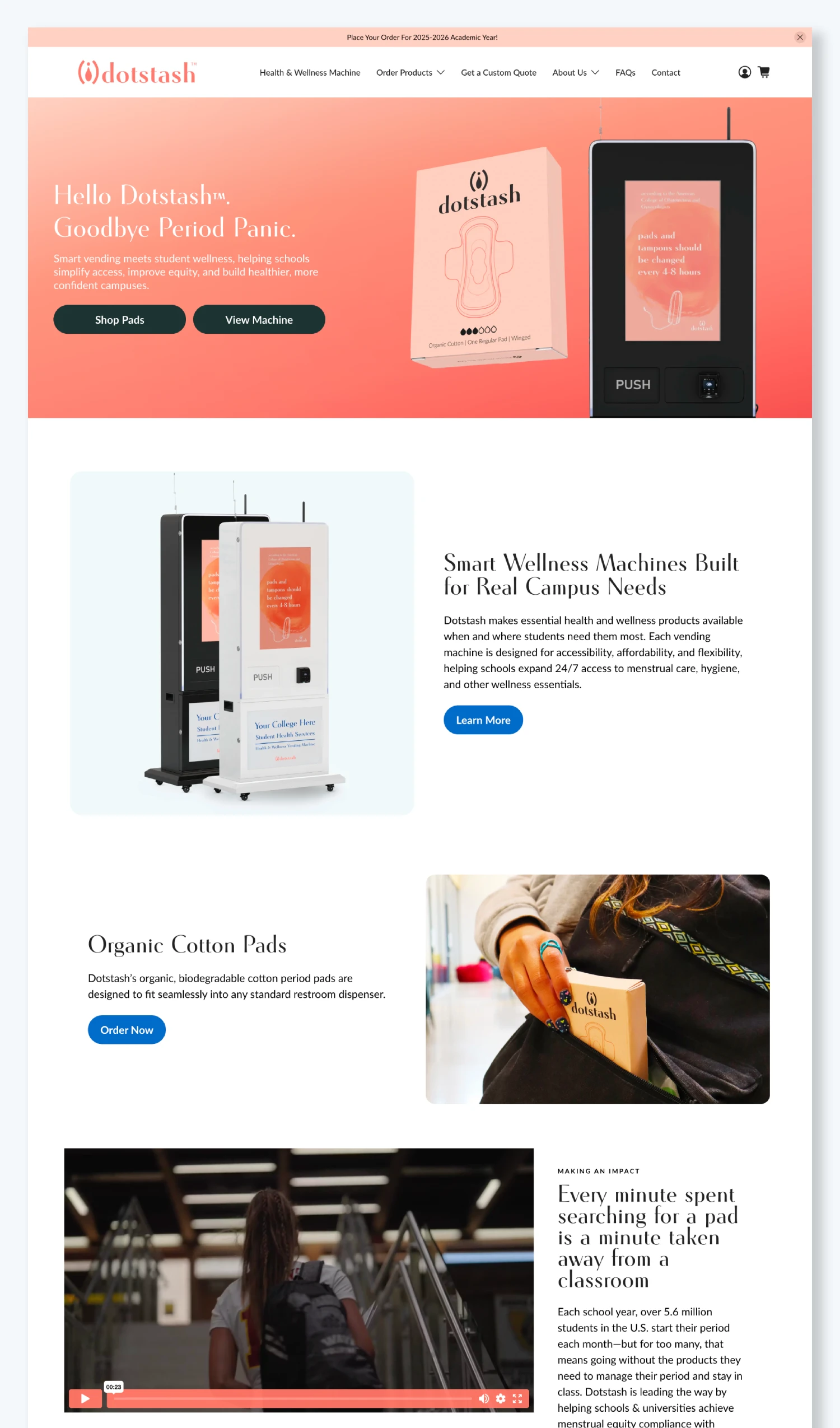
Hello Dotstash. Goodbye Period Panic.
We joined forces with Dotstash to redefine how students access everyday wellness. Blending brand strategy, creative production, and digital innovation, Stranded launched a campaign that introduced Organic Cotton Pads and Smart Vending Machines across campuses nationwide. Our work spanned brand identity, Shopify experience design, photography, film, and CG product renderings, all crafted to inspire confidence and normalize the conversation around menstrual health. Stranded continues to lead ongoing marketing strategy and optimization, empowering Dotstash to expand its impact and bring student wellness into a new era.
Storytelling with Impact
Stranded, in collaboration with filmmaker Brock Vanheel , produced a video campaign aimed at destigmatizing menstruation and promoting menstrual equity. The series follows individuals at different life stages—from high school to college—as they share their experiences and highlight Dotstash’s initiative to make organic, biodegradable menstrual products accessible through Smart Health & Wellness Vending Machines for Schools in public spaces. Filmed on school campuses and narrated by students, the videos use authentic storytelling to underscore the importance of supporting menstruators and fostering open conversations around menstrual health.
Visualizing the Dotstash Experience
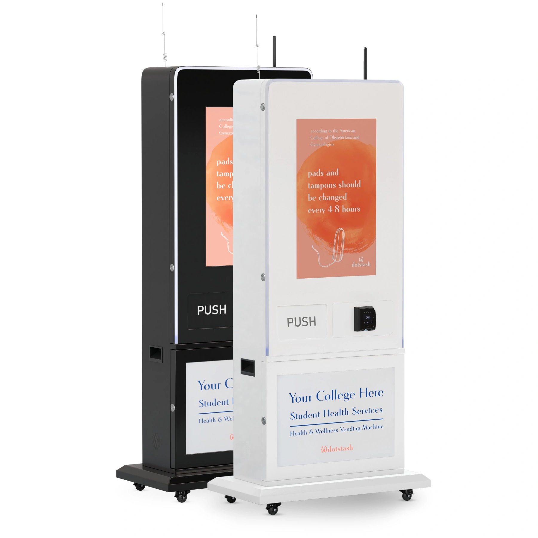
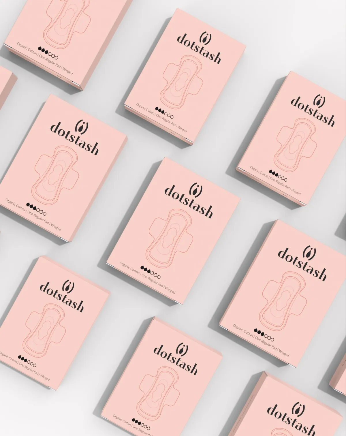
We created high-fidelity, high-resolution 3D renderings for Dotstash to visually communicate the brand’s core values of sustainability, accessibility, and thoughtful design. Alongside the organic cotton pad and recyclable packaging visuals, the new smart health and wellness vending machines were modeled and rendered to showcase every detail, from the form factor and user interface to campus branding placement. The period pad icon featured on the box was designed by Lillian Nguyen, whose work brought clarity and cohesion to the packaging system. Each asset was created to support digital, web, and print campaigns, ensuring that administrators and institutional buyers could see exactly what they would be receiving. Every angle and texture mattered in building trust, clarity, and confidence in the Dotstash experience.


Building Trust from the First Scroll
We designed the Dotstash homepage to do more than showcase a collection of products; it establishes the brand’s tone and purpose from the moment visitors arrive. Anchored by the headline “Hello Dotstash. Goodbye Period Panic,” the layout delivers immediate clarity and confidence. Our UX approach centered on seamless navigation, guiding users from awareness to action with minimal effort. Bold whitespace, warm brand colors, and thoughtful visual balance create a sense of calm and approachability. A clear content hierarchy helps facilities managers and buyers quickly find what they need. Every element, from call-to-action placement to mobile responsiveness, was designed to build trust, encourage engagement, and redefine how menstrual care is presented in public spaces.
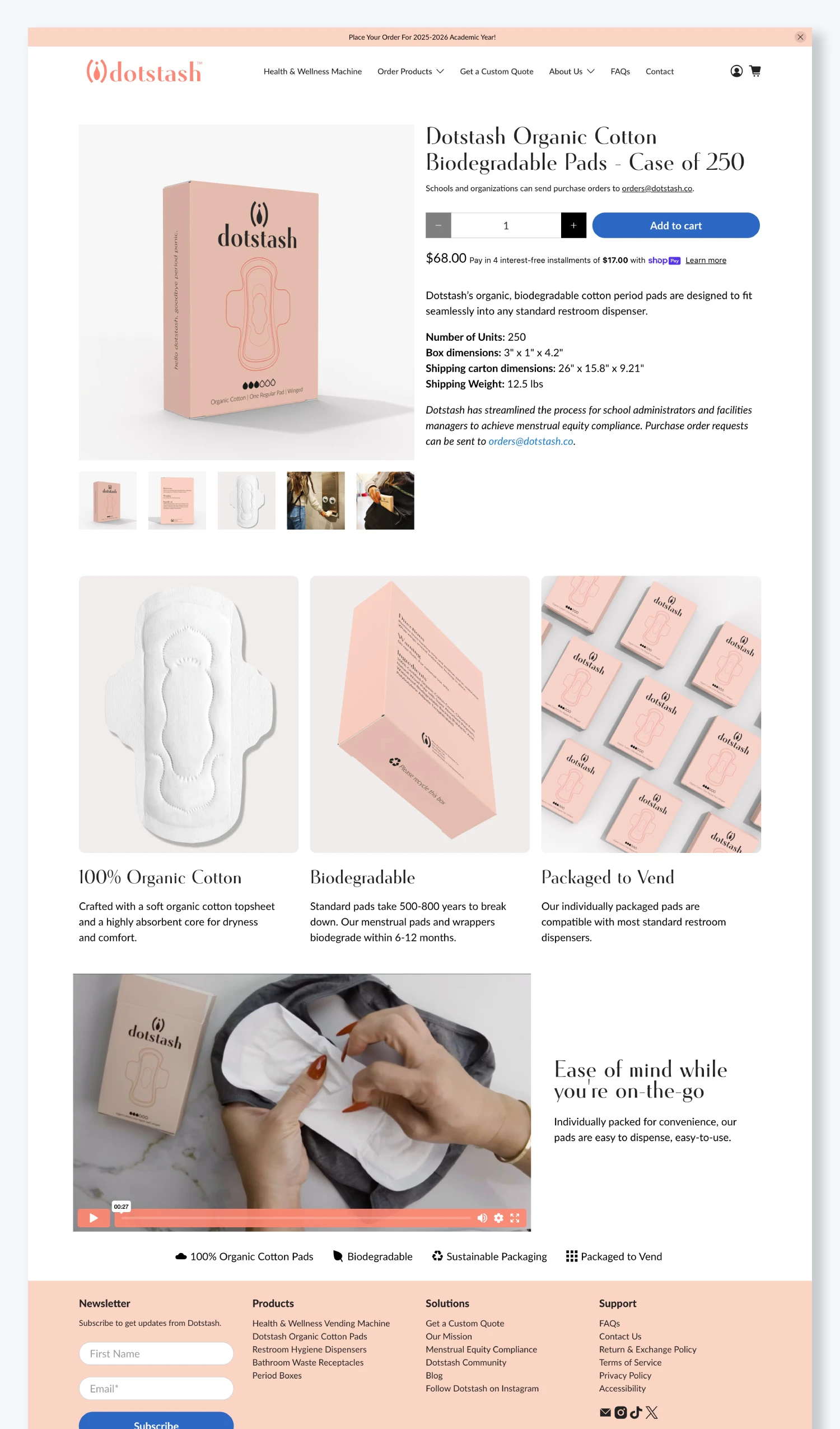
From Product Specs to Human Impact
The product page for Dotstash’s Organic Cotton Pads was crafted with equal parts precision and empathy. Inspired by brands like On, we elevated a simple e-commerce experience into a tactile, story-driven journey. Clean scroll flow, crisp visuals, and intuitive hierarchy guide both students and institutional buyers through the details that matter most. Close-up photography emphasizes quality and texture, while lifestyle imagery grounds the product in real-world context. Key specifications such as dimensions, shipping weight, and dispenser compatibility are placed exactly where decision-makers expect them, removing friction and building trust. The result is a thoughtfully designed page that transforms a utilitarian item into a considered, human-first wellness solution..
More Customer Stories


Book Your Free 30-Minute Strategy Session
A free 30-minute strategy session to review your current marketing, align on your goals, and map a smarter path forward. No pressure. Just clear, honest insight.
